Struggling to find the right font for your GIMP projects? Don’t worry, you’re not alone. Searching endless websites and sifting through questionable downloads can be a real drag. Fonts are a vital component of your overall design library. The selection of the right font can help you convey the desired message through your creatives easily. In this article, I will share some cool free fonts you can use in your GIMP projects. All the fonts are available on popular websites so you don’t have to worry about safety and security.
If you are new to working with fonts on GIMP, I recommend you to read my article on How to Download and Install Font to GIMP first.
Cool Free Fonts for GIMP
1. Heather
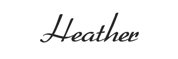
Heather is an excellent choice for your next GIMP project! The OpenType font has been designed to look like handwriting, making it ideal for putting on the wall or sending out via email. It comes with several weights and styles, so you can find the one that suits your needs best.
Features
- Handwriting Style: Designed to resemble natural handwriting.
- Versatile Weights and Styles: Comes with several weights and styles for diverse design options.
- Multilingual Support: Supports multiple languages for a broader range of creative applications.
Use Cases
- Ideal for Wall Designs: The font’s handwriting style makes it great for projects like wall designs.
- Suitable for Digital Communication: Perfect for emails, giving a personal touch to your digital messages.
Download from here.
2. Valerie

Valerie is the right choice if you’re looking for a GIMP font that will make your invitations and announcements stand out. It has a serif style and is available in a variety of weights. The typeface is also highly readable at small sizes, making it ideal for invitations and other printed pieces.
Features
- Serif Style: Characterized by a serif design, offering a classic and sophisticated appearance.
- Versatile Weights: Available in a variety of weights for diverse design possibilities.
- Italicized and Oblique Versions: Two versions, including an italicized and an oblique version (found in its .otf file).
- Aesthetic and Unique Letterforms: Noteworthy for its aesthetically pleasing and unique letterforms.
- Modern Yet Luxurious Style: Offers a modern yet luxurious style, making it suitable for various projects.
Use Cases
- Perfect for Invitations: Highly readable at small sizes, making it ideal for invitations.
- Suitable for Printed Pieces: Versatile weights and styles make it suitable for various printed pieces.
- Adds Elegance to Projects: The modern and luxurious style adds an elegant touch to a plethora of projects.
Download from here.
3. Roboto

Roboto is a sans-serif typeface designed by Google as the system typeface for Android. Released on May 6, 2009, with version 2.0 of the operating system, it has since been included in all subsequent versions. The font family is available in several weights, including light, bold, and italics.
Features
- Geometric and Square Design: Described as “geometric” and “square,” with a design that is “a bit futuristic.”
- Various Weights: Available in 9 different weights, ranging from thin to black, catering to diverse design needs.
- High Legibility: Highly legible, making it suitable for both small and large screens.
- Modern Appearance: Its overall appearance has been likened to Helvetica Neue or Futura Bold, with a clean and modern look.
Use Cases
- Versatile Applications: With 9 weights, it’s suitable for a wide variety of design applications.
- Legible on Screens: Ideal for both small and big screens due to its high legibility.
- Contemporary Design: Fits seamlessly into contemporary designs with its clean and modern appearance.
Download from here.
4. Bebas Neue
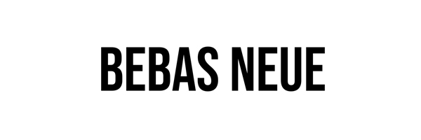
Bebas Neue, a creation by Ryoichi Tsunekawa, is a remarkable free sans-serif typeface tailored font for GIMP users. With options in both light and regular weights, this font serves diverse personal and commercial purposes, requiring only attribution. The font is readily available for download on Google Fonts, providing accessibility for a range of design needs.
Features
- Sans-serif Versatility: Bebas Neue offers versatility in its sans-serif design.
- Light and Regular Weights: Choose between light and regular weights based on your design requirements.
- Open Source: Being open-sourced, this font is free for personal and commercial use, promoting accessibility.
Use Cases
- Striking Headlines: The bold outlines and geometric shapes make Bebas Neue ideal for attention-grabbing headlines.
- Logo Design: Elevate your logo designs with the modern aesthetics of Bebas Neue.
- Branding Applications: Whether it’s headers or brandings, Bebas Neue adds a touch of sophistication to your designs.
Download from here.
5. Jura

Explore the modern elegance of Jura, a versatile font that you should keep in your GIMP fonts list. adds a contemporary touch to your GIMP projects. If you’re into crafting cool campaign banners or just want a font that screams contemporary, Jura’s got your back. And the best part? It won’t cost you a dime for personal use!
Features
- Modern Vibes: Jura rocks a design that’s as modern as your favorite tech gadget.
- Double Trouble: You get both regular and italic versions, giving you the power of choice.
- Do-It-All Font: From everyday body text to fancy formal serif faces, Jura’s your versatile companion.
Use Cases
- Catchy Headlines: Need a font that steals the spotlight? Jura’s elegance is perfect for creating headlines that turn heads.
- Easy on the Eyes: Even in tiny fonts, Jura stays readable, making it a go-to for those lengthy projects.
- Timeless Appeal: With its elegant and timeless design, Jura’s the go-to choice for designers who want that extra oomph.
Download from here.
6. Axia

Looking to jazz up your creative projects with some cool GIMP fonts? Well, you’re in for a treat with Axia! Crafted by the genius behind Avenir and Neue Helvetica, Axia offers a geometric allure reminiscent of Futura. It’s not just a font; it’s a statement for your headlines, logos, and designs.
Features
- Designer Magic: The same creative mind behind Avenir and Neue Helvetica is the wizard behind Axia. Your projects are in for a treat!
- Cool Geometry: Picture this – Axia rocks a geometric style like Futura. It’s like adding a sprinkle of elegance to your project effortlessly.
- Styles for Days: Axia doesn’t settle for the usual. You get to pick between Stencil Light and Stencil Black styles for those extra cool effects and attention-grabbing headlines.
Use Cases
- Clarity Rules: With clean, simple shapes, Axia ensures your message is crystal clear, leaving no room for confusion.
- Easy on the Eyes: Axia’s got clean and simple letters too, making sure your words shine with crystal-clear precision. No more guessing games!”
Download from here..
7. Aileron Thin

Aileron Thin is a free font by Adobe. It can be used in various projects, from business cards to websites. It’s not just for headlines and body text, though—it works great as a sans-serif font too! The rounded corners make it easy to create nice-looking headers and footers without looking too busy or distracting.
As compared to the rest of the Aileron family, the Aileron Thin features a very minimal and thin geometric design. The clear shape and consistent spacing also allow you to use the font on smaller sizes. You can easily use it as body text for magazines and web interfaces.
If you’re on the lookout for a versatile and free GIMP font, Adobe’s Aileron Thin is your go-to choice! This font isn’t just about headlines and body text; it’s a game-changer that seamlessly fits into various projects, from stylish business cards to captivating websites.
Features
- Multitasking Master: Aileron Thin isn’t picky. It tackles it all, from headers and footers to body text and website banners. No need to juggle multiple fonts for different elements.
- Friendly Curves: Those subtle rounded corners add a touch of personality without going overboard. Headers and footers pop without being distracting, making your designs both eye-catching and easy to read.
- Thin and Trim: Unlike its chunkier Aileron family members, Aileron Thin rocks a sleek, minimalist design. This means it plays well with small spaces, making it perfect for body text on websites and magazines, even at tiny sizes.
Use Cases
- Website Hero: Need your website to make a lasting impression? Aileron Thin’s confident lines and clear readability make it ideal for headlines, banners, and call-to-action buttons.
- Magazine Magic: Aileron Thin adds a touch of modern sophistication to magazine layouts. Use it for headlines, subheadings, and even body text for articles that are both stylish and easy to read.
- Social Media Standout: Make your social media posts pop with Aileron Thin. Its clean lines and versatile nature work wonders for captions, graphics, and even story highlights.
Download from here.
8. Lato
Lato is another popular Google font you can use in your GIMP projects for free. It’s a simple looking font look really good for long-form texts.
The Lato letterheads come with a slight curve and rounded edges, ensuring a very friendly and approachable design. With a total of 9 different weights, Lato has a wide range of applications. You can use it for headlines on branding, or the body of your text. The high readability of the font also makes it suitable for small-size applications.
Looking for a sleek and free GIMP font? Meet Lato, a popular choice from Google fonts that effortlessly elevates your GIMP projects. It’s not just a font; it’s your key to adding a touch of simplicity and style to your designs.
Features
- Simple Sophistication: Lato’s simplicity brings elegance to your GIMP projects, making it a perfect fit for long-form texts and beyond.
- Friendly Design: The slight curve and rounded edges of Lato’s letterheads create a friendly and approachable aesthetic, ensuring a warm welcome to your readers.
- Versatility in Weights: With a diverse range of 9 weights, Lato adapts to any application—whether it’s commanding headlines for branding or offering clarity in the body of your text.
Use Cases
- Branding Brilliance: Lato’s versatility shines in creating impactful headlines, adding a touch of sophistication to your branding efforts.
- Readability: Lato’s high readability makes it a top choice for small-size applications, ensuring your message is delivered with clarity and precision.
Download from here.
9. Exo

It offers a very elegant design, backed by subtle geometric details. Not to mention, the legibility of the Exo font, ensures that it is perfectly suitable for various screens, in both large and small sizes.
Use Cases
- Web Wonders: Give your website a stylish makeover with Exo—it’s like adding a touch of magic. See how your online space transforms into a visual treat that captivates every visitor.
- Social Media Star: Make a statement on Facebook or Twitter with Exo as your icon. Your brand will be the talk of the digital town, catching everyone’s attention!
Download from here.
Recommended: 25 Best GIMP Plugins and Filters You Can Use
So, Which font You Will Use in Your Next GIMP Project?
That’s it for this article. Do let us know your favourite font in the comments below. Alternatively, you can always explore Google Fonts and Adobe fonts for finding free fonts for your next GIMP project.


")